
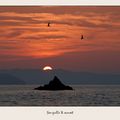
Attack!
Some sea-gulls & backlight
Comentarios
29


Información
| Sección | Nature: Coastal areas |
| Vistas | 2.246 |
| Publicada | |
| idioma |

|
| Licencia |
Insertar foto
Incluye el siguiente enlace en un comentario, descripción o en un mensaje para mostrar esta foto.
El enlace ha sido copiado...
Por favor haz clic en el enlace y utiliza la combinación de teclas "Ctrl" [Win] o "Cmd" [Mac] para copiar el enlace.
Compartir en Messenger
Incorpora el siguiente enlace en el campo de comentarios de la conversación deseada en Messenger utilizando 'Pegar' para enviar esta imagen en el mensaje.
El enlace ha sido copiado...
Por favor haz clic en el enlace y utiliza la combinación de teclas "Ctrl" [Win] o "Cmd" [Mac] para copiar el enlace.
hrishikesh thakur 19/05/2009 19:44
yesssssssssssssssssssssssss ! nice shotDmitri Zakovorotny 27/03/2006 9:12
Thanks for opinions.Your attention is very important for me.Jan Van Der Hooft 26/03/2006 16:40 Comentario de la votación
Dont like the light like thisContra
Christian Knospe 26/03/2006 16:40 Comentario de la votación
+++When 26/03/2006 16:40 Comentario de la votación
I'm just not grooving on it. Don't know why, just not my thing, maybe because it is TOO well composed, seems contrived, too textbook.Abdul Khaliq 26/03/2006 16:40 Comentario de la votación
Guys, Your Pro's are taking me deep into the Picture so many times but still i coudn't come to any discission to give PRO.@Valdimir, is there some thing hidden or out of my tought ?
I have to still vote.
Patrick B. Parenteau 26/03/2006 16:40 Comentario de la votación
Pro - so subtle - pastel and elegant with lots of space to fly. The birds make the shot.Dagmar E. 26/03/2006 16:40 Comentario de la votación
proDominic Falcone 26/03/2006 16:40 Comentario de la votación
ProValfoto 26/03/2006 16:40 Comentario de la votación
For the mood created................. PROSeagaul 26/03/2006 16:40 Comentario de la votación
O.k. the horizon is hardly visible and not straight the overall impact is less attacky, it is more honouring the number 3.You should have cropped more seriously the right part right away. Colors are a bit to weary.
I say pro for the invisible hints and secret meanings.
Peter Kis kalóz 26/03/2006 16:40 Comentario de la votación
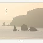
The shoreline is not straight (0,3 degrees) but the shoreline is far , so we can say this is the horizon.:)PRO!
Ron Couwenberg 26/03/2006 16:40 Comentario de la votación
Pro!Robert Riley 26/03/2006 16:40 Comentario de la votación
So, the horizon is straight, or not, I cannot tell, and it does not matter. PRO.Victor Servián 26/03/2006 16:40 Comentario de la votación
Perdón, quise decir CONTRA.